about shop patterns projects printables extras sponsorship wild olive twitter flickr pinterest subscribe
Showing posts with label good to great. Show all posts

formatting photos for retina display

RetinaDisplays1


Fair warning: This is a geek post for people with blogs. It's also long. You've been warned.

Not too long ago I decided that it was time for me to get a new laptop. It has already resulted in my getting more patterns made whilst keeping me engaged with the people around me. It was a good choice.

One of the features on my new Mac Book (which of course, I bought before the new models were announced) is retina display. This never seemed like a big deal to me, and wasn't important, and then I experienced it. Everything on the screen is so clear, so crisp, so beautiful! Except my blog wasn't.

My blog images displayed kinda blurry on my new screen, and I didn't like it. And if it looks that way to me, it must look that way to others with retina display. And I looked at other sites and found that some blogs and websites look good, and others have that same blur.

But before I get too far, let me show you what I mean. Some of this will be simulated to account for different displays, and I'm hoping that it works properly!
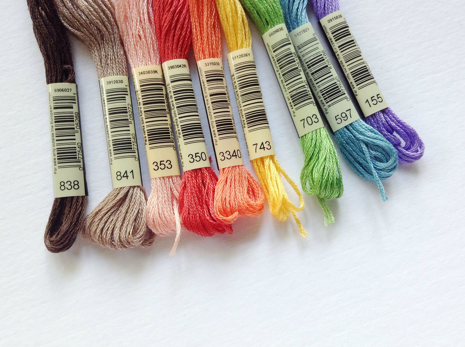
Embroidery colors

Above is how this photo should look on any computer screen. I've made some adjustments to my image coding and size to have it look pretty on a retina display.
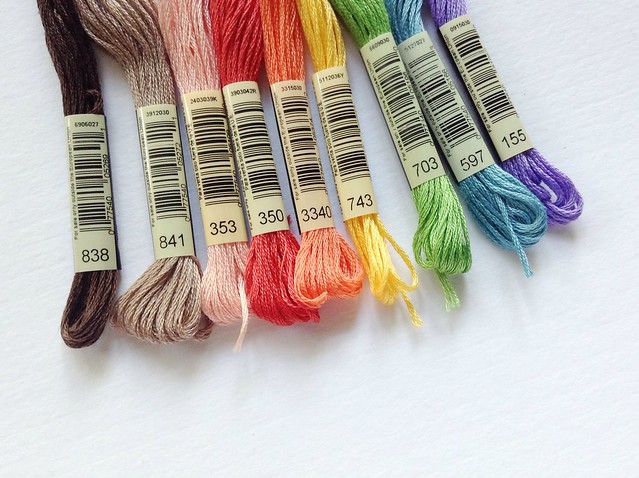
Embroidery colors

The image above now has different settings. If you're on a standard monitor, a laptop, or mobile device, this probably looks fine to you as long as you don't zoom. But if you're viewing on a retina display, notice that the photo just isn't as crisp.
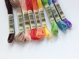
Embroidery colors

Now, this last image shows the blur, even if you're on a standard display. Without adjustment, this is how all the images on my blog (and potentially yours too!) look on a retina display. (On retina, it's just plain scary.)

Now, is this a big deal? Is anyone hurt by this? Certainly not. But whenever I can, I want to present things in the best way possible. As I learn something new, I want to improve! I want to go from good to great! Plus, I have a feeling we'll be seeing more of this sort of display coming along.

So, here's where it gets technical.

Photos are made of pixels, and my main blog column is 640px wide. So, I've been displaying the photos at 640px wide. That works for standard monitors.

Retina displays work by displaying twice as many pixels in the same space. So a 640px wide column actually shows 1280px. Tinier pixels all squished close makes the display so pretty! (I suppose that wasn't the most technical description...)

A Google search for retina display blog photos turns up some help on the topic, and I recommend having a look at that to find possible fixes for your blog platform. (This one didn't work for my blog, but helped me a lot.) Here's how I fixed mine.

My photos are hosted with Flickr.

I create all of my photos at 1280px wide or more. Actually, I usually make them at least 2000px wide, just so that I have edited copies at a larger size.

When I grab the html code from Flickr to place the images in my blog posts, it gives the option to choose what size you want. Instead of choosing the one that is 640px wide, I now choose the option for 1600px wide, or whichever is closest to 1280px, but still larger.

For your blog, you would choose whatever is closest to twice your blog width.

In the code, it tells the width and height that the image will display. I change the width to 640px and remove the height (it's not necessary, and I don't want to always do the math).

You're done! Now the images will display properly for both standard and retina displays!

And now I have to decide if I should go back in my blog posts and fix the images, or just move forward. I still have things to fix elsewhere on my blog (including my sidebar), so we'll see where I go with this. But I thought I'd share this sooner than later so you could get a jump on it...if you like geeking out about this sort of thing too!

Hopefully it's been helpful, and if you have any questions, I'll do my best to answer intelligently!

And a quick question for you: Have you noticed that the images on my blog are loading a lot slower lately, or about the same?

build starts soon


I'm not quite sure where the time has gone. Back in May, talking about an e-course that would start in July felt like I was getting ahead of things. Now suddenly the registration for the course is opening.

If you are interested in building a better blog, one that can take you far, help people, do great things, and more, I encourage you to check out BUILD. It's a self-paced course, and it's not something that you can just quickly flip through and make a few simple changes to your current blog. This thing is thorough. And amazing. I'm just getting started looking through everything, but I can tell you that the information I've seen so far is spot on.

Sign up for nine months of FREE blogging tips today, and get discounted pre-registration through Monday. But you'll need to act fast for the opportunity for great savings!

I'm thrilled for author/creator Amy Schubert, who has quit her day job to pursue writing and blogging full time. (Proof that she knows what she's doing!) I'm also very happy to be a guest contributor and affiliate for the e-course. Go check it out!

build: a community, a business, a blog.


Last week I shared a review of the book When Talent Isn't Enough, which looks what goes into a creative business, and I heard from a lot of you who are looking to make your blog, shop, or even a future endeavor all that it can be. Even with a book that gets you going, it doesn't just happen. You have to work at it, you have to build it, and I encourage you to do just that.

Amy Schubert has been putting together a mega e-course, called BUILD, that is all about building your blog, and just about everything that goes with that: design, monetization, creating content, upkeep and more.

If you're just getting started and want to get your blog right from the start, this is a course for you. Or if you've been doing this for a long time, but feel like there's more you can do, this is a course for you. Amy knows her blogging, and she's a great person to learn from (plus she's super sweet!).

Pre-sale for BUILD starts July 4 (half price!), with regular registration starting July 9. Until then, you can sign up for NINE MONTHS of free weekly emails with blogging tips. Do it! (You really can't go wrong with that offer...)

I'm also very honored that Amy asked me to do a guest interview for BUILD. When you sign up for the course you can see and hear me talk with her about selling digital products through your blog. I'm pretty sure that I look ridiculous, but since my most recent product launch has had more than double my goal, I hope that you'll find the information I share to be helpful. For a sneak peek at my #1 tip, visit Lemon and Raspberry.

book review: blogging for creatives

Blogging for Creatives

From time to time, I've posted tips on taking blogs from good to great, although it's been a while. Those tips may show up again in the near future...but for now, let me tell you about a book that is all you'll really need.

Blogging for Creatives covers just about every topic you might need to know as a blogger, and it does so in a very visual way. There are tons of screen captures, both from blogging resources and actual blogs. (Shown on my blog is the British cover...Amazon has the American version.)

Blogging for Creatives

Whether you're just getting started, or looking to make a change or improvement, there are basics like choosing where to blog, and how to set up your template.

There are also more advanced things, like mobile blogging, creating podcasts, and adding sponsorship.

Blogging for Creatives

I should also say, I got to contribute a tip! Fun!

There's so much information in here, but it's in bite-sized chapters and sections. I've only skimmed it so far, because I know that once I start really getting into this, I'll be ready to try things out and make some adjustments to my own blog.

I do want to note that with a book like this, with lots of technology references, there are some things that won't always be up-to-date. But there's also lots of things that will remain true always. Any way you look at it, at around $13 on Amazon (at the time I'm writing this), you'll get your money's worth!

planning out blog posts

blog planning

The other day on Twitter, I mentioned that my January blog calendar was nearly all planned out. Someone replied asking how I go about figuring out my blog posts so far in advance, and her question felt like it deserved it's own post. So, I picked out the first open date on my blog calendar, and planned for writing about a plan.

Lots of people have written about this sort of thing, and I'm adding to the conversation because I think it's helpful to hear it from different people with different styles. My blog schedule is probably the most organized thing in my life, so please realize that I'm not an expert when it comes to things like this. I think I've just found my groove on this one thing!

blog planning

Before I get to the planning and scheduling, I need ideas. My notebook is never too far away from me because you never know when an idea for a post or project might come up. I like to jot down what it is and sketch it out. Often I'll create several versions of one thing...sometimes I use one of them, other times they become a series. Sometimes I use the ideas immediately, other times they are for months in the future, and sometimes they never end up as anything.

But you have to start with ideas.

blog planning

I've found that the more ideas that I work on (and trust me, it takes some work to come up with them!), the more ideas I have. My Christmas Ornamentation series was going to be just five posts in one week. It ended up being three jam-packed weeks, and there were some ornaments that I scrapped. How did that happen?

When you start with one idea, then consider the options, then think about other uses, then change out some materials, then try...and it goes on and on...you can suddenly have lots to work with.

Quantity can lead to quality.

blog planning

Wild Olive has three main categories of posts, plus all the extras. These categories are: patterns (embroidery), projects (crafty diys), and printables (PDFs for you!). Part of planning means looking at what my options are for these types of posts. Actually, these are the areas that I work on the farthest in advance because they take more work up front, before the writing and posting can ever happen.

Elsie from A Beautiful Mess recently shared a snapshot of her planning process, and the color-coded cards above are my own version of what she showed. I'm still just playing with this style, and I haven't decided if I'll use it long term. For now, it's really fun to see a stack of ideas, and have them sorted by color category!

Dividing things into sections helps balance out the ideas.

calendar

Once I have the ideas to choose from, I pull up my Google Calendar. It's my favorite tool for organizing blog posts (I still write out some lists and such on paper or a white board, but the main calendar is online). You can click on the image and get a better look at what January looks like (but I did keep a few things hidden...I don't want to spoil too many surprises!).

Even when I'm only working on a particular week, I like to use the monthly view. All I have to do is click on a date, I type what my post will be, mark it for my "BLOG" calendar, and save. It makes an all-day event, which is fine for me. Rarely do I add more information than this, because I just need to see what is happening when.

Usually I start by putting in some posts that are "features". These kinds of things can be a life-saver, for example, my Snapshot Saturdays are always on Saturday, and they are simple to do. I also choose when I'll be doing any posts to feature my sponsors. After that, I consider any holidays or special days that I need to match posts up with. For example, Chinese New Year comes later this month, so I'll have a post or two for that.

Once I have those kinds of things figured out, I fill in with the ideas that I've been accumulating in my notebooks and on my cards. And here's the best part about working in Google Calendar...you can move around the events by dragging and dropping!

I need flexibility in my life. Sometimes I just can't get something happening on a date that I planned on, or I realize that I should slip a post in sooner rather than later. And so I move things. Just because I have a plan all worked out, doesn't mean that I live and die by it. That said, seeing all of those little squares filled in makes me feel a lot more comfortable.

Seeing the schedule prepares me for the work.

Just because I have all of these posts planned, doesn't mean the work is done. Now it's time to do them! The nice thing is that having the calendar lets prepare and pre-schedule posts in advance. Amy from Lemon and Raspberry has some great advice about this, but if I'm being honest, there are times when I post something "just in time". And that's okay! Most of the time, however, I avoid the panic of "what should I post about today?", which is sort of the point.

Wow, that was a wordy post for me! But I hope that my own experience with blog planning has been helpful for you. If you have any questions or tips of your own, please leave them in the comments! I'll be commenting and answering along with you!

PS: If you like planning on paper, take a look at my Blog Buddies planner pages, or the blog planner that Tara and I made!

good to great: rotating sponsor ad graphics


I'm about to do something I've never done here before. I'm about to share a technical tutorial. I've shared Good to Great ideas before, but this time I'm going to show you how to use javascript to get all fancy on your blog. Did you just fall off your seat? Oh wait...that was me.

I've taken a teeny bit of HTML in college (it was a while ago), and everything else I've learned has been from playing around with code, and by doing some Googling. Code can make me crazy, and sometimes I let other people do it for me, but there are times when I just need to fix something myself, and I do. There is a huge sense of satisfaction when I figure it out! So now you can too. (At least, I hope you'll be able to figure this out from me...remember this is my first code tutorial!)

If you haven't noticed, I have some awesome sponsors each month. I love them, and I'm not just saying that. Each of these sponsors deserves to be noticed, and so I try to rotate the location of their ads during the month so they get more viewing by you, my wonderful readers. Doing this manually is difficult, and I've not been convinced that it was all that effective. I wanted better.

After much searching and trying things out (because Blogger doesn't have a gadget for this), I found the way to have all of my ads change locations each time the page reloads. To see what I'm talking about, you need to be on the actual blog. See the ads? Refresh your page, and they'll change. All of the ads are still there, they just moved around. Exactly what I wanted.

If you have sponsors on your blog, or if you have some images that you want to rearrange in your sidebar, here's what you do:

rotateads1

In Blogger, click on the design tab, then add a gadget to your sidebar.

rotateads2

Choose the HTML/Javascript gadget. You'll get a box to add your code to, but first you need some code. Move that little box to the side, and then head to this site for the code. You'll need to copy all of the text that is in the box for "Step 1."

rotateads3

Paste the code into the Blogger box that you moved to the side. Now, go back to this site, and copy all of the code that is in the first gray box.

rotateads4

Paste it under the text that you already added to the Blogger box. Take a look at the image, and you'll see some text that is different from what you get from the Javascript Kit website. But it's close.

First, I have a line that starts with the img tag. That's the graphic that says "sponsors" in my sidebar. This doesn't apply to the rotation, so it doesn't need special code around it.

Next, there is the div tag that is just like the copied code. This is "group1", and it will remain at the top.

Under that is the link and image tags that display Amy's ad. It is the only x-large ad I have, and it is its own group..."group1".

Then the div tag closes.

The "div", "a href" "img" and "/div" sections all repeat, but with the label "group2". This grouping is all of my large ads, and they will all shuffle locations. Every large ad has this "div" tag with the "group2" label on it.

Sara's ad is the first that you see here, but all the rest are the same. And it doesn't matter what order you have them in, because they'll all show up in a different order each time.

Make sense?

rotateads5

After all of the ads have the code surrounding them, go back to the site, and grab the code from the last gray box. Paste it at the very bottom of the Blogger box, then save.

If everything went as planned, all of your ad graphics should be showing up, and they should be shuffling locations each time you refresh the page. Your sponsors will love you!

Oh, and since today is the last day of the month, some of my sponsors will be changing over tomorrow, so it's a good day to point out that you should give these blogs a visit!

good to great: great blogging resources


If you are a blogger, and you want to take your blog from good to great, I have two resources for you today:

Amy of Lemon and Raspberry did a series this week about Better Blog Content. I've been blogging for years, and she still got me thinking about things, and looking to improve my blog. You're gonna want to check it all out. (Amy is a sponsor, but that's not why I'm promoting this.)

Bryan Allain writes a very humorous blog, and he's starting up a new website called Blog Rocket. The site is designed to help grow blogs, and right now, when you join his mailing list, he'll send you an eBook on overcoming blogging frustrations. There is a lot of good stuff in it, and it's free. (I might even consider getting a membership when the rest of the site launches.)

I started writing Wild Olive nearly seven years ago, and even if no one read, I would still write it. That said, growing, improving, and taking things from good to great are important to me. If they're important to you, check these out.

good to great: only words


(Be warned: This is a long post with only words. But that’s what this is all about: words!)

I think we can all agree that online tutorials are so wonderful. Especially when when folks share them for free. (Not that we should expect everything to be free, but it is a nice gift from time to time!) But there are a few things that I really want in a tutorial:

1) Good photos. (See this previous Good to Great post)
2) Clear instructions. (That’s what this post is all about!)
3) Usable patterns. (Good to Great post on this coming Soon!)

I think that these are things that take a tutorial from good to great.

For a few years now, I’ve been sharing tutorials on my blog. Some have been written poorly, some are a bit better, but recently I’ve been really making an effort to improve the these DIY posts.

When I write my posts, I always include photos of the step-by step-process. For those who are more visual (as creatives, isn't this be all of us?), it helps. For myself, I can often just look at the pictures from a tutorial and figure it out. So, it would be easy to think that good photos could take the place of well-written instructions. But the words are very important: they direct and they clarify.

Consider if you didn’t have photos to accompany your instructions. Maybe the links to them got messed up, they didn’t load, or perhaps the reader has a different way of viewing your post. Would the tutorial still be easy to understand?

Here’s a post of mine from 2009, but without the pictures:

On a piece of muslin with a loose-ish weave, I traced my circles. They are the size of the bottom of my Burt's Bees lotion bottle. What? A real measurement? Fine. 1.75" in diameter. Then I freehanded these patterns, and stitched them up. They were not cut out at this point.

I placed my stitched fabric onto a second layer of muslin, and cut out the circles. Then I stitched them together with a running stitch.

I had considered putting eyelets through these, and I might try one like that, but I ended up just pushing a jump ring right through the fabric. I helped it along by making a hole with a large needle first. This process required a bit of practice. First I opened the jump ring a bit, then I made the hole, and then holding the ring with a pliers, I fed it through the hole and closed up the ring again. If you don't get it through the hole right away, the weave closes, and you'll need to make the hole again.


Could you follow this? Maybe. But it requires a bit of deciphering.

Mistake #1: I wrote about the process from my point of view, and in a passive voice (“On a piece of muslin, I traced my circles”). Writing direct instructions in the active voice is easier to understand (“Trace 1.75” circles onto muslin”).

Mistake #2: I was needlessly wordy. Editing is your friend.

Mistake #3: I didn’t include a list of materials needed. The materials were simple (which is probably why I didn't write them out), but they should have been listed at the start.

What did I do right? I made it personal. Maybe too personal (see mistake #1), but this is my blog. It’s not a book, or part of something “official”. I believe that adding a bit of yourself into your work is a good thing, just do it sparingly. More as an aside.

Here’s how I would re-write the post in question:

You will need:
muslin fabric
embroidery floss
jewelry jump rings

For each charm, trace a 1.75” circle onto the muslin. Embroider small designs within the circles. (I stitched mine without a pattern.)

Place the embroidered muslin over a second layer of muslin and cut out the circles.

Stitch around the circles with a running stitch.

Use a large needle to poke a hole in the fabric at the top of each charm. Open a jump ring, then push it through the hole in the fabric. Close the jump ring. (This can be a little tricky, but keep trying!)

Hang the charms onto a necklace chain.


Easier to understand? Even without photos? I think so.

Writing clear instructions can take practice, but I’ve found that modeling my step-by-step instructions after others helps, as does writing bite-size pieces with simple terms. Oh, yeah, and sometimes a bit of narrative for fun.

Hmm...now I feel like I should go back and re-write all of my tutorial posts...

good to great: adding white


Today I want to share with you ad idea that can help take your photos for tutorials from good to great. I learned when when looking at a photo that someone else took. It was bright and airy, and I spotted the trick. It's a simple, fast idea, and it's a little cheaper than buying a DSLR camera. Actually a lot cheaper. This is going to cost you less than $2.

Here's what you do. Buy a large sheet of white art paper.

That's it! Poster board will also work, but art paper has a nice texture to it, and I like that. You can find it in the art departments at many stores like Hobby Lobby. Mine came from Blick, and I also picked up a couple other colors (although, they require a bit more work...start with white).
photo-setup
I choose an area that is getting some good (not-too-harsh) sunlight, and I set up my paper something like this. Sometimes I even lay it on the floor near a large picture window.

When you are taking photos for a shop, having some sort of context or props can help, but with tutorials simplicity puts more focus on the steps that you are showing. Having a cluttered background makes it harder to see.
d60-counter
But just because the background is simple, doesn't mean you'll get the best photos. This was taken yesterday as part of the tutorial I shared, using my Nikon d60, and a 50mm lens. It's a fair photo.
d60-white
This is taken on my white art paper, same camera, same lens, same settings, same location. See how much brighter it makes things? The white paper helps to bounce extra light for your camera lens to pick up. But I promised you that you didn't need a fancy camera for this to make a difference, so take a look...
cybershot-noflash
This is using a Sony Cyber-shot. The flash was turned off, and all of the settings were on auto. Not to great.
cybershot-flash
Here's using the flash. Better, but the results can vary, and often the flash looks so harsh, and I don't want that.
cybershot-bright
Finally, this is no flash, but with the brightness setting on the camera bumped up just a bit. This here is why you should get to know the settings on your camera. White balance is an amazing tool. I don't use the camera as often these days, so had I played even more, I probably could have gotten this to be a bit warmer.

All that you've seen have been straight from the camera, with no editing done. Just the help of that $2 piece of paper. Pretty good, huh? Maybe even great, compared to a dark cluttered photo. Now, let me show you what can happen if you give your pictures just a tiny bit of help in a program like Photoshop.
cybershot-actions
For this one, I've taken that last shot from the Sony, and used two free actions from Pioneer Woman. Slight Lighten and Warmer. Wow! This is no longer a typical point-and-shoot kind of picture.
d60-actions
Even my photo taken with the Nikon could use a bit of extra help, so I used just the Slight Lighten action from Pioneer Woman.

I am not an expert at this, so maybe I shouldn't be telling you how to set up photos. But I do take a lot of pictures, and this is one of those tips that I wish I had known years and years ago. (Seriously...take a look at my old archives...yikes.) Try it, and if you have luck with it, I'd love to see your photos!

good to great: simple blog template


One of the things that I wanted to talk about for this new feature is the idea of taking the look of your blog from good to great. I'm continually thinking about this for my own blog, and thought you might like to do the same.

My tastes are simple, uncluttered, and with lots of white space (which isn't always white). Pugly Pixel's site Powered by Pastries has lots of tips to achieve this aesthetic. Better yet, she offers some extremely lovely templates for a set price.
200254501-001
Even better still, today only she is making one of the templates available for free! It's called Strawberry Shortcake, but it reminds me of of this strawberry milkshake photo. Soft, a little swirly, but still nice and basic.

If you are looking for a way to update the look of your blog, head over there and download the template. It's still very customizable, but will take care of the framework with an amazing elegance. I'm downloading it just to have available if I need to make a change around here...

good to great: a new feature


Two new features in one week? And after I wasn't sure that I should have them at all? Crazy. Today I'm introducing an idea that has been growing and expanding and if I'm not careful, it could get huge. It's a personal challenge, and one that I think a lot of you will find helpful too. The idea is simple: Go from good to great.

When something is good, it's easy to leave it that way and accept that it is good. That's enough. And good can mean different things for different people. But even good can be improved upon. Great is possible. (And yes, eventually great may become good, and you can make it better still.) I'm not an expert on making things great, but I do settle for good enough far too often, so that counts for something.

One of my 2011 goals is to organize this blog. I've realized that there needs to be more to making that happen, and visually, I need to keep the place tidy for it to be organized.

Full disclosure: It's very easy for me to see what other blogs are doing and think that I should be like them. But I shouldn't. I should be me, and I'm good with that. But sometimes seeing what others do can get you thinking about your own style, right?

Anyway, as a first step in visually tidying the blog, I moved a few things around. I also removed a few things, which will (hopefully soon!) find their way onto separate pages. I found this video tutorial to be especially helpful when thinking about the layout and open space. It's not quite the great that I'm looking for, but already I'm liking the openness. I feel like it is more me, and definitely easier to take in the content that is here.

How about you? What are you ready to take from good to great?